progress_dialog
progress_dialog
A light weight package to show progress dialog. As it is a stateful widget, you can change the text shown on the dialog dynamically.


Supported Dart Versions
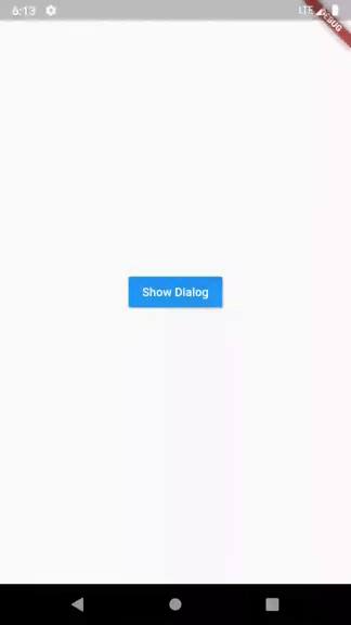
Dart SDK version >= 2.1.0Demo
Installation
Add the Package
dependencies:
  progress_dialog: ^1.2.0
How to use
Import the package in your dart fileimport 'package:progress_dialog/progress_dialog.dart';
ProgressDialog pr;
- Initialize the ProgressDialog object
pr = new ProgressDialog(context);
//For normal dialog
pr = new ProgressDialog(context,type: ProgressDialogType.Normal, isDismissible: true/false, showLogs: true/false);

//For showing progress percentage
pr = new ProgressDialog(context,type: ProgressDialogType.Download, isDismissible: true/false, showLogs: true/false);
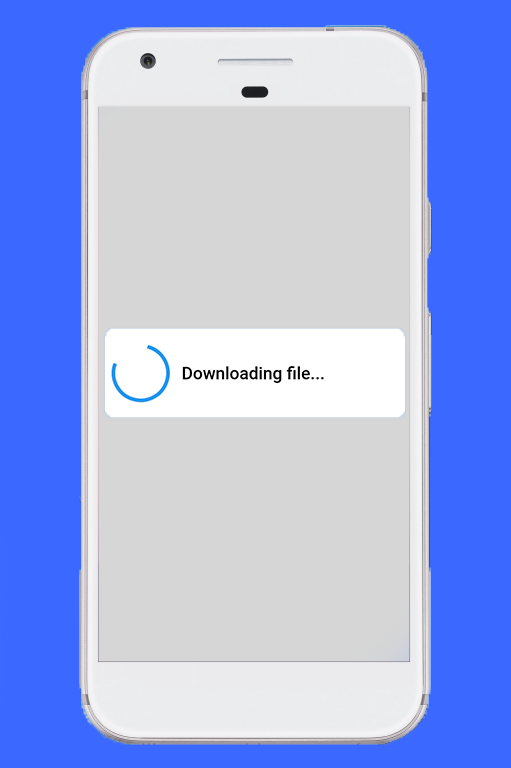
pr.style(
  message: 'Downloading file...',
  borderRadius: 10.0,
  backgroundColor: Colors.white,
  progressWidget: CircularProgressIndicator(),
  elevation: 10.0,
  insetAnimCurve: Curves.easeInOut,
  progress: 0.0,
  maxProgress: 100.0,
  progressTextStyle: TextStyle(
     color: Colors.black, fontSize: 13.0, fontWeight: FontWeight.w400),
  messageTextStyle: TextStyle(
     color: Colors.black, fontSize: 19.0, fontWeight: FontWeight.w600)
  );
Note: You don't need to use all parameters, all of them are optional
pr.show();
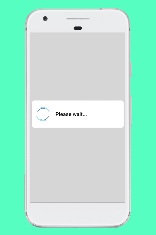
pr.update(
  progress: 50.0,
  message: "Please wait...",
  progressWidget: Container(
    padding: EdgeInsets.all(8.0), child: CircularProgressIndicator()),
  maxProgress: 100.0,
  progressTextStyle: TextStyle(
    color: Colors.black, fontSize: 13.0, fontWeight: FontWeight.w400),
  messageTextStyle: TextStyle(
    color: Colors.black, fontSize: 19.0, fontWeight: FontWeight.w600),
  );
Note: You don't need to use all parameters, all of them are optional
pr.hide().then((isHidden) {
  print(isHidden);
});
Navigating to next screens must be done after the completion of Future - hide(). See here for example
Check if progress dialog is showing
bool isProgressDialogShowing = pr.isShowing();
print(isProgressDialogShowing);
Demo
Default configuration/styles
If you don’t like to configure/style the dialog and continue with the default style, it’s okay but just have a look at our default configuration.| Attribute | Value |
|---|---|
| Dismissible | true |
| ProgressDialogType | ProgressDialogType.Normal |
| BackgroundColor | Colors.white |
| BorderRadius | RoundedRectangularBorder(radius: 8.0) |
| AnimationCurve | Curves.easeInOut |
| Elevation | 8.0 |
| ProgressWidget | Double_rings_loding_indicator |
| MessageTextStyle | color: Colors.black, fontSize: 19.0, fontWeight: FontWeight.w600 |
| ProgressTextStyle | color: Colors.black, fontSize: 13.0, fontWeight: FontWeight.w400 |
| showLogs | false |
Well let’s discuss limits for configuring it
| Attribute | Can be updated during instantiating | Can be updated during styling | Can be updated during dialog is shown |
|---|---|---|---|
| Dismissible | Yes | No | No |
| ProgressDialogType | Yes | No | No |
| BackgroundColor | No | Yes | No |
| BorderRadius | No | Yes | No |
| AnimationCurve | No | Yes | No |
| Elevation | No | Yes | No |
| ProgressWidget | No | Yes | Yes |
| MessageTextStyle | No | Yes | Yes |
| ProgressTextStyle | No | Yes | Yes |
| ShowLogs | Yes | No | No |
Want to contribute?
Pull requests and issues are always welcome!How to contribute?
- Fork the repository
- Clone it to your local machine
- Open the project in your favourite editor
- Open cmd/terminal and run flutter clean and then flutter packages get
- Make the changes
- Create a Pull Request
View the issues here
This library is only tested for Android, iOS contributors are most welcome
Loading indicator -> https://loading.io/


For amazing flutter stuff go to http://flutterfun.com/
ReplyDeleteFor flutter tutorials go to Flutter
ReplyDeleteFor flutter material go to FlutterFun
ReplyDelete